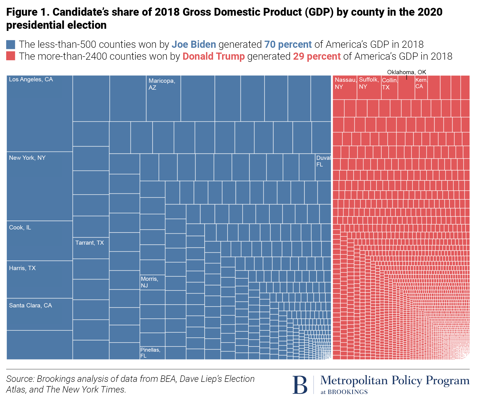
Politically conservative simpletons in the United States of America are fond of posting on social media maps of the nation that have each county colored either red for a Trump victory in 2020 and blue for a Biden victory that year. They like to do that because it colors the U.S. mostly red for Trump. And it is true that Trump won more than 2,500 counties and Biden fewer than 500 during that election.
What the simpletons either don’t realize, forget, or ignore is that not all counties in the U.S. are equal. Trump indeed won thousand of largely empty or sparsely populated U.S. counties. Yet although Biden won few than 500 counties, he won those where not only most U.S. citizens live but in which 70-percent of America’s economy resides. Trump overwhelming won Texas’s Loving county (population: 54) but Biden overwhelmingly won Los Angeles county (pop.: 9.9 million),
It is infantile for politically conservatives to post colored maps showing that Trump won a greater geographic aggregate of the emptier counties in the U.S.. Elections are instead won by gaining the greater number of citizens’ votes, which Biden did during 2020 by more than seven million votes (equal to more than 109,000 Loving county’s). However, if it makes simpletons feel better to post such maps, give them all the red and blue crayons they need. I expect a similar outcome from the 2024 election.