Here are two well done data visualizations by mathematician and software design Brad Lyon and graphic designer Bill Snebold.
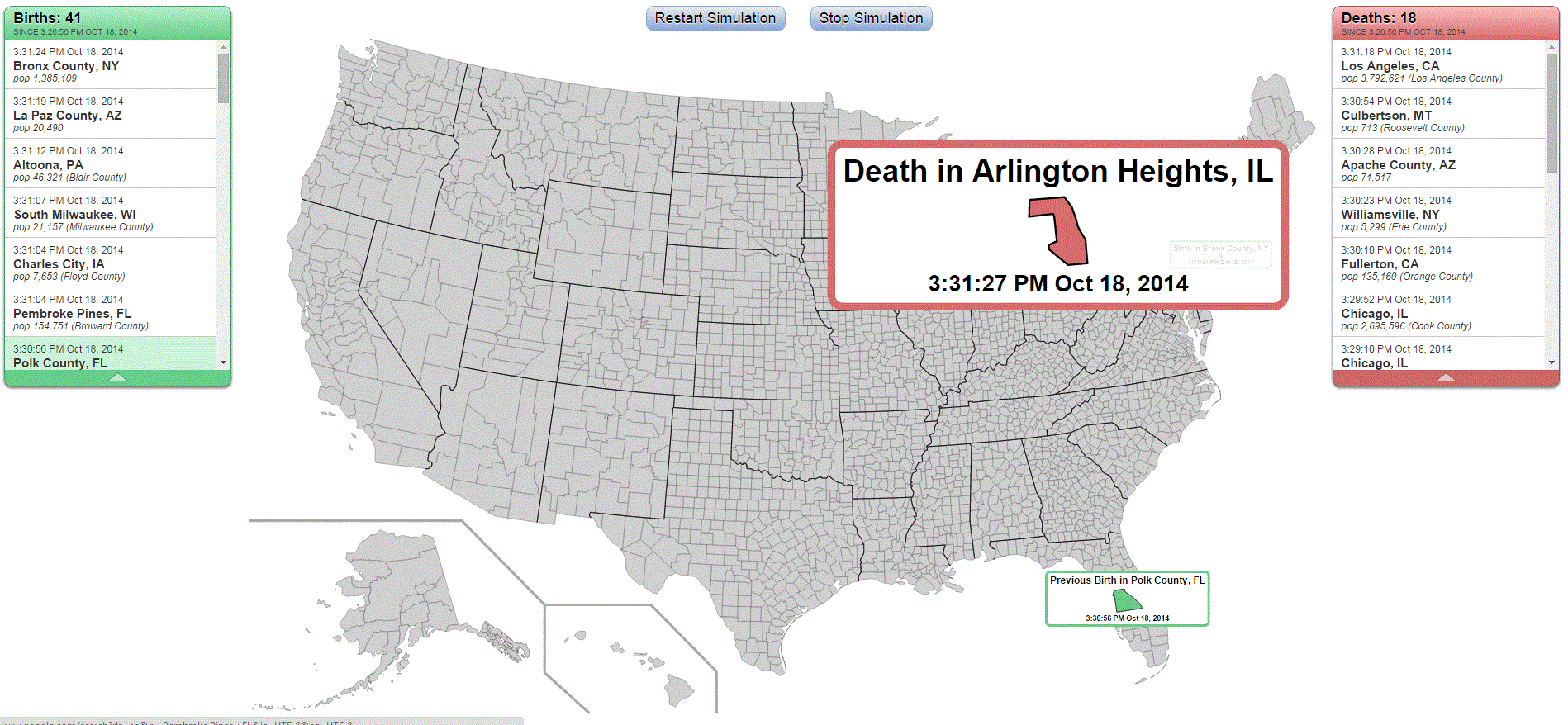
The first depicts real-time information about births and deaths in the United States. Whenever and wherever one of those events occurs, the map shows it.
The second depicts the same real-time information worldwide. (Click ‘Restart Simulation’ if either data visualization doesn’t automatically start when you visit it).
The Atlantic monthly magazine explains more background about these data visualizations.